


Redesign 1: Homepage (Above the Fold)
-
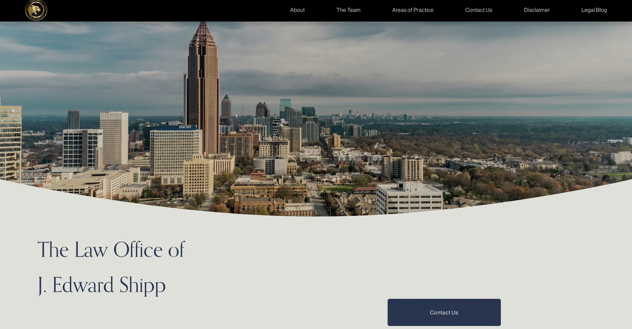
Monochromatic black and gray color scheme on the homepage.
Lack of a prominent call-to-action button.
Misalignment of the homepage title ("Your Premier Litigation Firm") with the firm's current focus.
Absence of the firm's name at the top of the homepage.
Testimonials placed in the navigation bar, potentially overwhelming visitors.
-
Introduced a vibrant cityscape hero image to enhance visual appeal and create a positive first impression.
Added a "Contact Us" button for a clear call to action, redirecting users to call the firm office directly.
Altered the homepage title to better reflect the firm's focus, removing emphasis on litigation.
Placed the firm's name above the fold on homepage for improved branding and identity.
-
Improved user engagement with a vibrant hero image capturing the essence of the firm's headquarters.
Enhanced user experience with a clear call to action through the "Contact Us" button.
Aligned the homepage title with the firm's current focus, fostering clarity and relevance.
Strengthened brand identity by prominently displaying the firm's name at the top of the homepage.
-
Visual Hierarchy: Utilized a vibrant hero image to create a focal point and establish a visual hierarchy.
Clear Call-to-Action: Implemented a "Contact Us" button to guide users and encourage interaction. Accessibility: Easy one-click call option.
Competitive Analysis: Informed design decisions by studying elements used by other successful firms.
Branding and Identity: Placed the firm's name prominently for consistent branding and identity.
Simplicity and Clarity: Removed unnecessary elements and streamlined the navigation for a clearer user experience.
Redesign 2: About Us
-
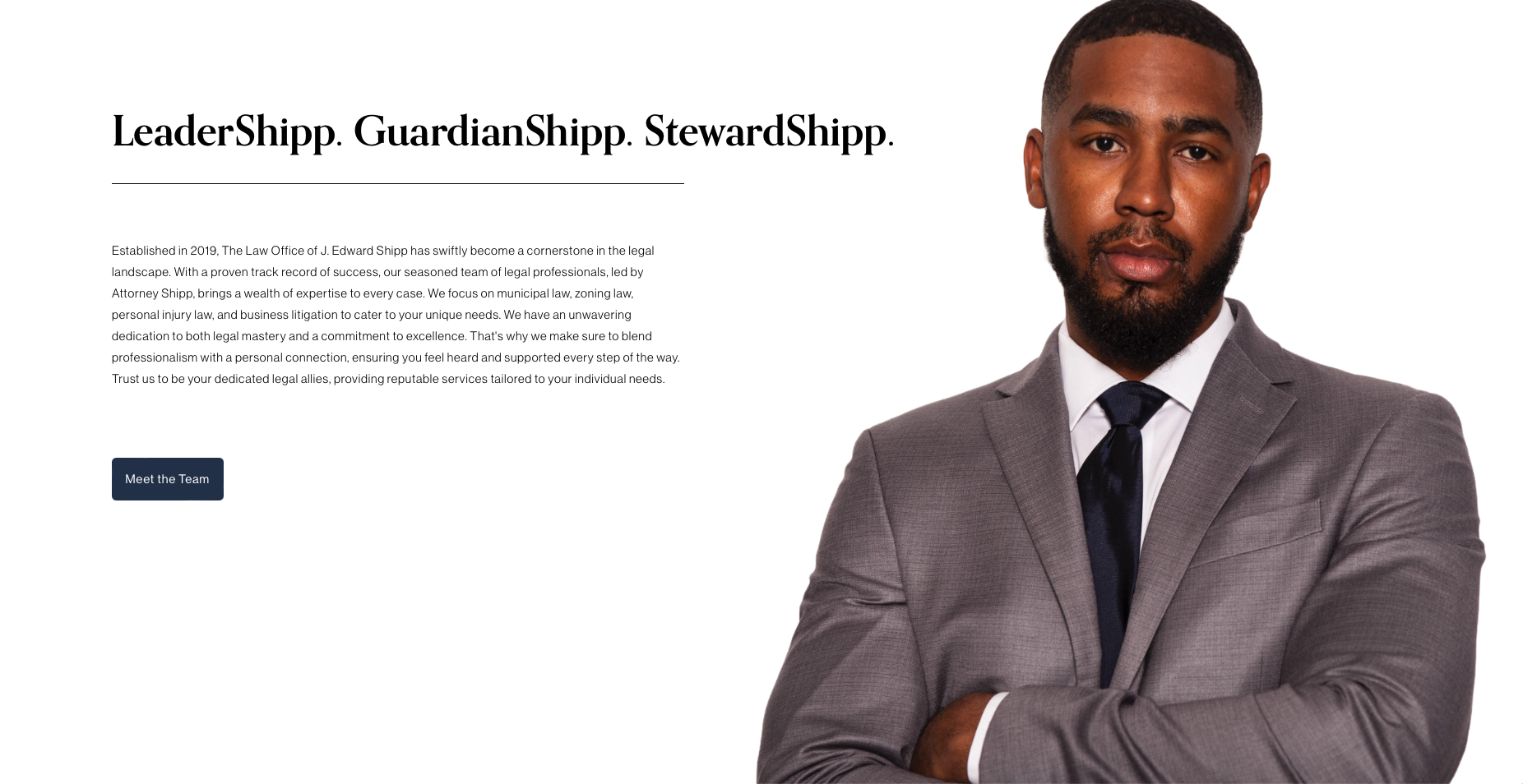
Uninviting and cold color scheme on the About Us page.
Copy focused exclusively on the individual attorney.
Redundant information presented on both the About Us and "The Team" pages.
-
Replaced uninviting colors with warm and engaging visuals.
Revamped copy to shift focus from individual attorney to the collective strength of the firm.
Introduced a "Meet the Team" button for detailed team information on a dedicated page.
-
Improved user experience with a friendlier and more inviting design.
Streamlined content by reducing redundancy and organizing information.
Enhanced transparency and connection with visitors through the dedicated "Meet the Team" button.
-
UX Writing/User-Focused Language: Copy shift emphasizes collective firm strength, adhering to usability principles, ensuring user-focused language that highlights the value and benefits of the firm to the visitor.
Color and Visual Hierarchy: Warm color shift aligns with strategic color use, creating a more inviting atmosphere, enhancing user experience, and contributing to engaging visual hierarchy.
Information Architecture: Copy revamp and redundancy reduction align with information architecture principles, ensuring streamlined structure for users to find details without unnecessary repetition.
Call-to-Action Placement/Hierarchy of Needs: "Meet the Team" button introduction aligns with clear calls-to-action, strategically guiding users toward exploring team details and addressing their need for a deeper understanding of the firm's expertise.
Redesign 3: Areas of Practice
-
Lack of visual appeal and engagement on the "Areas of Practice" page.
Inclusion of outdated content (felony litigation) and absence of immediate user interaction options.
-
Replaced uninviting colors with warm and engaging visuals.
Revamped copy to shift focus from individual attorney to the collective strength of the firm.
Introduced a "Meet the Team" button for detailed team information on a dedicated page.
-
Enhanced Visual Appeal: The introduction of a hero image and engaging visuals significantly improved the overall visual appeal of the "Areas of Service" page.
Increased Engagement: Clear calls-to-action, such as "Explore our Services" and "Schedule a consultation," fostered immediate user interaction, enhancing engagement.
Improved Accessibility: Relevant images, titles, and concise descriptions for each area of law made the content more accessible and user-friendly.
Accurate and Up-to-Date Information: The removal of outdated content (felony litigation) ensured that users receive accurate and current information, preventing confusion.
Intuitive Navigation: Consistency in design elements created a more intuitive and cohesive user experience, allowing users to navigate the page with ease.
Positive Perception: The combination of these improvements contributed to a positive user perception, fostering trust and confidence in the law firm's online presence.
-
Visual Hierarchy: Implemented a hero image and engaging visuals to establish a clear visual hierarchy, guiding users through the content.
User Engagement: Introduced a prominent call-to-action ("Explore our Services") and a consultation button for immediate and meaningful user interaction.
Content Accessibility: Utilized relevant images, titles, and concise descriptions to enhance the accessibility of information.
Content Accuracy: Removed outdated content (felony litigation) to ensure accurate and current representation.
Consistency: Maintained consistency in design elements, such as the placement of key calls-to-action, to create a cohesive and predictable user experience.
Redesign 4: Attorney Showcase
-
Absence of a dedicated page to showcase the attorney's media appearances and insights on top cases covered on news stations.
Limited visibility of the attorney's notable cases and contributions to news outlets.
Lack of a centralized platform for potential clients to easily access and rewatch news coverages.
-
Created a dedicated page highlighting the attorney's media appearances and insights on top cases.
Crafted copy that names specific high-profile cases and news stations to enhance SEO and showcase expertise.
Included a large professional image of the attorney for a personalized and trustworthy visual representation.
Embedded videos of news coverages directly on the page, providing users with easy access to revisit media appearances.
Integrated YouTube links for each video, offering users the option to watch on the platform of their choice.
-
Enhanced the online presence of the attorney by spotlighting notable cases and news station collaborations.
Improved SEO by strategically incorporating top names and cases, attracting a broader audience.
Increased user engagement with the inclusion of videos, allowing visitors to watch and rewatch news coverages conveniently.
-
Content Strategy: Developed compelling copy with specific case names and news stations to boost SEO and showcase expertise.
User Engagement: Embedded videos directly on the page to enhance user interaction and convenience.
Accessibility: Provided alternative viewing options by including YouTube links, catering to diverse user preferences.
Information Hierarchy: Structured the page to prioritize key information, ensuring easy navigation and a focused user experience.